 It all seemed so promising, NBC announcing it would stream every event live online from Sochi, complete with announcers, more than 1,500 hours in all.
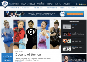
But if you’ve been to NBCOlympics.com, you know that the potential and reality are miles apart. In fact, trying to find any specific event on the site should be an Olympic sport all its own.
 Daily on Twitter and Facebook, people are asking for links to help them find a specific live stream or highlights. Don’t even think about looking for videos embedded on those or any other site. NBC took a step five years backwards with its videos, preventing users from enjoying them anywhere but on their own site.
So we’re essentially trapped. Geofencing prevents anyone in the US from watching highlights or live streams from any other broadcaster. And NBC’s greed means you have no choice but to navigate their site.
But just how bad is it, really? For an informed answer I asked my JWT colleague and usability expert Adrienne Sangastiano to dig into the site. The fact that she immediately started comparing the site to the hotel room trashed by US bobsledder Johnny Quinn should have been my first hint about her perspective.
 “During the first few days of Sochi, all I heard was shock at how unfinished and poorly executed the experiences were for a WORLD event,” she said. “The NBC Olympics website is just as guilty for their lack of structure and insufficient navigation as the Sochi hotels are for their broken doors.”
“From labeling lavatories to event schedules, people need to know where they are going and must see a clear path for how to get there. The lack of clear labeling, content tagging, and search support does not serve NBC users well,” she said.
But her critique was just getting started. In short, the site may highlight content that NBC wants to promote, but overall it fails to organize itself around what visitors are likely seeking.
- Results & Schedules > There isn’t anything that says “results” within the page content (seriously command+f it!).
- Results & Schedules > There is no way to filter results by sport.
- The information scent (the intuitiveness) of the navigation labels overlap and create confusion:
- How does Results & Schedules differ from Medals?
- How does Results & Schedules differ from TV Listings?
- The horizontal sub-navigation convention limits the visible sport breadth to only 5, requiring a user to select “All Sports.”
- The search function is minimized by only displaying an icon and not providing sufficient clear space around it to draw user attention.
- The search functionality has bugs and often doesn’t display a search field. Search bar character length is short and cuts off after 17 characters.
- Sponsor banners and ads (directly below navigation) disrupt page content. Page regularly reloads to display a new banner (and god forbid it’s the Kellogg’s one that takes up 80% of the white space on the screen).
Were NBC to offer a defense, my guess is they would point to the apps launched to support the broadcast. They offer two: NBC Olympics Highlights and Results is the workhorse, and the second is the NBC Sport Live Extra app that offers content based on what’s airing at that moment. And that’s all well and good.
Reading between the lines of all this is a nagging awareness that NBC execs won’t be happy unless they can drive people to their televisions. View the website through that bias and suddenly it’s a gem.
About Project TILWO — I watch Sochi 2014 Olympic coverage on TV and online then share the lessons I learn, with occasional help from my friends. Edited by Lynn Hess @ Premier Proofing.
Connect With Us